Seasonal Skincare: Adjusting Your Beauty Routine for Winter
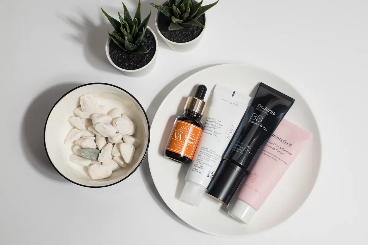
A practical winter skincare guide: gentler cleansing, layered hydration, smarter use of actives, and...


Two prints in one outfit can look like a stylist's work or like you got dressed in the dark. The difference is rarely talent. It comes down to a few decisions you can make in front of the mirror in under a minute: which print leads, how big the motifs are, and which colors hold everything together. Once you know what to look for, mixing prints stops feeling like a gamble.
Every successful print mix has a star. Decide before you start which piece owns the look, then treat everything else as support. A bold floral midi skirt is the star; the shirt you wear with it is the chorus.
This matters because two loud prints compete for attention, and the eye doesn't know where to land. If your trousers are a large-scale abstract print, keep the top quieter — a small stripe, a fine check or a solid. If your top is the statement, let the bottom be the calm one.
A quick test: squint at your outfit in the mirror. If one piece still reads clearly and the other fades into texture, you've got a lead print. If both shout at the same volume, swap one out.
The single most useful rule for beginners: keep the sizes of the motifs different. Small dots with a big botanical print. Thin pinstripes with chunky oversized checks. A tiny ditsy floral with wide horizontal stripes.
Prints of similar scale fight because the eye reads them as visual noise. When one print is dainty and the other is generous, the brain sorts them instantly — small, big, small, big — and the combination reads as deliberate.
If two patterns still feel like too much, replace one with texture. Cable knit, denim, corduroy, lace, satin and leather all add visual interest without adding another motif. A printed dress under a chunky knit cardigan gives you the same layered feel with none of the risk.
Prints that share colors will always look related, even when the patterns are completely different. Build your mix around two or three colors and repeat them across both pieces.
Say your floral blouse has a cream background, soft pink blooms and green leaves. A green-and-cream gingham skirt works with it, and so does a pink-and-white stripe. The patterns don't match — the palette does, and that's what people actually notice.
Neutrals are your safety net. Black, navy, cream, camel, grey and olive all play nicely with almost anything, so a printed piece plus a neutral printed piece is a reliable starting point.
These are reliable starting points, not rules. Try one, adjust, and note what worked.
Messy usually means the outfit has no resting place for the eye. Try these fixes in order:
Also check your proportions. Two prints work best when they're separated by a solid waistline or when one print occupies a much smaller area — shoes, a scarf, a bag — than the other.
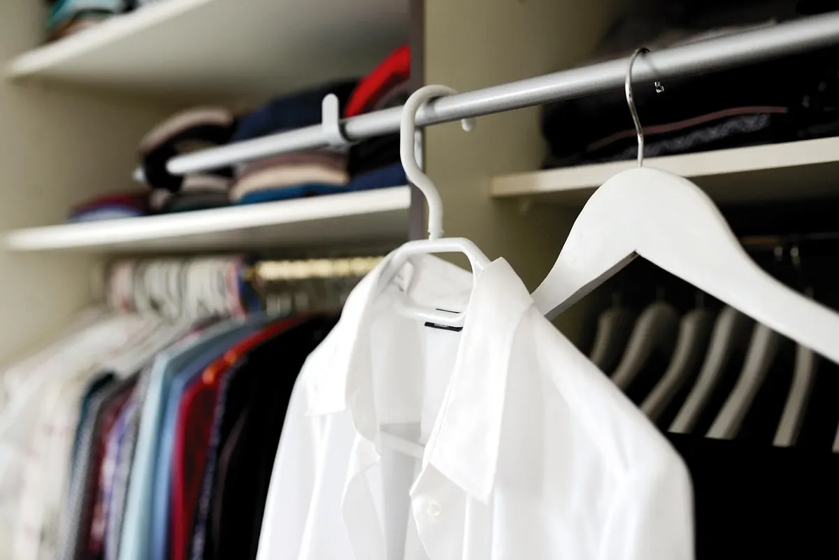
Start with two prints, not three, and build the outfit around a solid anchor piece: plain trousers, a white shirt, a neutral blazer. Stand three feet back from the mirror and take a photo. Photos flatten an outfit and make clashes obvious in a way mirrors don't.
If it looks good in the photo, wear it out. If it doesn't, change one thing — the scale, not the whole outfit — and shoot again. After a few tries you'll start recognising the combinations that work for your wardrobe, and mixing prints will feel less like a risk and more like a habit.
Photo: theglassdesk / Pixabay
A practical winter skincare guide: gentler cleansing, layered hydration, smarter use of actives, and...
Ten well-chosen pieces can build weeks of outfits. Here's the essential starter checklist, what to look...
Parisian chic is a set of editing habits, not a birthright. Here's how to build the look with eight key...